The Binomial Option Pricing Calculator does not just calculate option prices and Greeks, but it also allows modeling and charting the effects of different factors (like time to expiration, volatility or interest rate) on options. This page explains how.
Chart Modes
There are two chart modes, which you can switch in the dropdown box in cell F6 in the Main sheet.
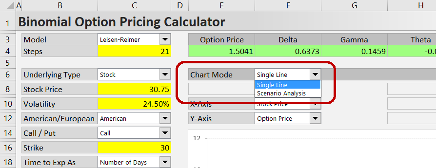
The first mode displays a single line in the chart, showing the effect of a single factor on option price or Greeks.
The second mode, Scenario Analysis, models combined effects of two different factors, displaying up to three lines for three scenarios.
Single Line Mode
Working in the Single Line mode is very simple. You only need to set the X and Y axes:
In the dropdown box in cell F10, select one of the model's inputs to put on the X-axis.
In the dropdown box in cell F12, select option price or one of the Greeks to show on the Y-axis.
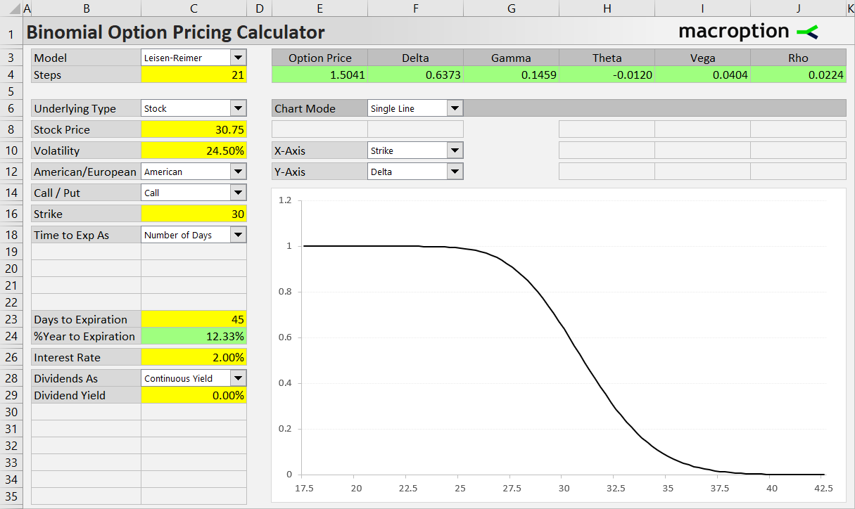
For example, when the X-axis is set to Strike and Y-axis is set to Delta, the chart will show the deltas for different strikes,which may be useful when selecting the best strike for a potential trade.
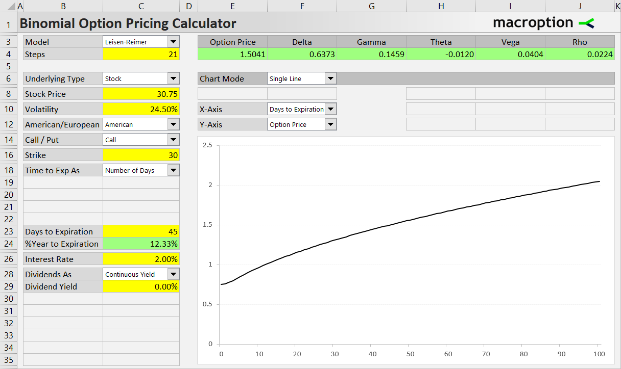
Similarly, when you set Days to Expiration on the X-axis and Option Price on the Y-axis, you will see how the option's value will decay as it gets closer to expiration.
Depending on the time to expiration format selected in the dropdown box in cell C18, you can make the X-axis show number of days or percent of year to expiration, or valuation date or expiration date.
For instance, the next chart models the same thing as the one above, only with valuation date instead of number of days on the X-axis (so the direction is reversed - time passes from left to right on the X-axis).
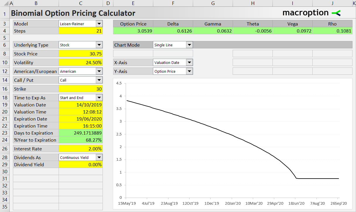
At expiration date and beyond (right end of X-axis), the line becomes straight and the displayed option price equals payoff at expiration.
Zooming and Shifting the Chart
You can easily control the chart's scale with the buttons located on the right.
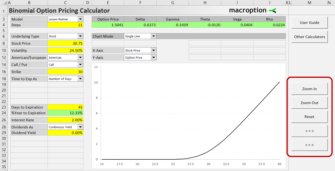
The first two buttons change the level of detail - zoom in or out.
The two buttons at the bottom shift to the right or left along the X-axis.
The Reset button in the middle returns the chart scale to its initial position.
When any of the inputs is changed, the chart scale is automatically recalculated based on the X-axis input's value.
Scenario Analysis
The Single Line chart always assumes only the factor on the X-axis changes, while all the other inputs remain the same. If you want to model the combined effect of two different factors, use the other chart mode, Scenario Analysis (select it in the dropdown box in cell F6).
For detailed instructions and examples, continue to Scenario Analysis.